New Gmail Design
Okay, so I like the new Gmail design – cleaner and more whitespace – just looks much more modern that the existing one.
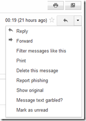
Though, I’m still not keen on having to go across to the little ‘back arrow’ reply icon, click the dropdown next to it, just to get to the ‘actions’ I can carry out on an email.
‘Forwarding’ is two clicks when I simply want a single click for it. I’m surprised no one has come up with a greasemonkey script that does this – maybe I need to stop whinging and write myself one.
Microsoft do a good job in the old Outlook Web Access (2003 and 2007) and in the newer Outlook Web App (2010)
What do you think ?
This post is licensed under CC BY 4.0 by the author.

