Android Development / Hundred Pushups App
This is a bit of a mixed post, Eclipse / Android development versus Visual Studio / Windows development, and a bit of self promotion of my ‘Hundred Pushups’ app.
I have been a fan of the Hundred Pushup Challenge for some time, having done weeks 3 – 6 a number of times and completed the challenge a few times.
A few months ago while I was on the site I noticed there was an iPhone app for it but no Android app. I had been looking for excuse to build ‘something Android’ for a while and this looked like an ideal candidate (I am a massive Android fanboy !!).
The application requirements were not too complex, provide the 6 week, times 3 day, time 3 level schedule, a way of recording workouts and tests and some figuring out accelerated advancement of weeks based on test results. A bit of database back end, a bit of schedule / table UI and a couple of screens each for workouts and test.
I downloaded the Android SDK, tools and development environment (Eclipse) and got started. I use subversion for source control and there is a well integrated SVN plugin for Eclipse, so that was all fine. The first hurdle was the framework / API, but that is fairly common when looking at a new framework / toolset – and is simply down to experience. So, although things took longer than I expected, I have no complaints there – plenty of online examples on how to do various tasks.
The next hurdle was the UI – it has to be said that the UI tools for Android are nowhere near the sophistication of the Visual Studio experience. This is not down to developer experience, or understanding different methodologies – the UI design tools are just not there – there is no visual layout tool. I found this to be the most frustrating aspect – rework the xml layout definition, trial run, scratch head as to when certain elements were just not visible – rinse and repeat.
As a comparison, I just finished a client component for some back end technology I have been working on – this has treeview controls, three interlinked datagrids, toolbars and menus with buttons, dropdowns and dropdown buttons – this took around 3 days, compared to over two weeks with Android for a main ‘switchboard’ screen with button branching off to four ‘task’ screens – no complex UI elements al all.
The reason Microsoft and .NET are so ubiquitous is the barrier to entry is so low – they give the tools away for free (express SKUs) and the UI design / prototyping is so fast – I can have a complex desktop UI application up and running in hours, not days. Android has some way to go before it can match this, and , unfortunately, I feel that even though a Microsoft / Windows tablet may be technically inferior (i.e. more bloated), it will win in the end because the development tools are easier making applications more readily available / pervasive.
Gratuitous Self Promotion
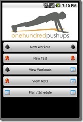
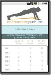
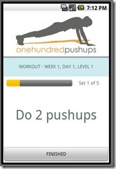
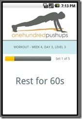
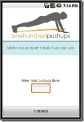
So, unfortunately, when I got my Hundred Pushups app completed the guy responsible for Hundred Pushups had already agreed to give the digital rights to someone else. He asked me not to release my app in the Android Market, which I can respect. However, I do believe that (right now – April 2011) my app is better than the paid for version available from the people who have the digital rights. I have included some screenshots below. If you want to test this out then drop me a mail and I’ll left you have a copy…
